Native Instruments Komplete Kontrol Plugin
Skill: UX/UI
Role: Senior UX Designer
Year: 2021
Komplete Kontrol
As a musician, Native Instruments is one of my favorite companies creating innovative toolsets and sound systems for composers. Their products are legendary for their superb sound quality and ease-of-use, and are a part of my every day composition arsenal.
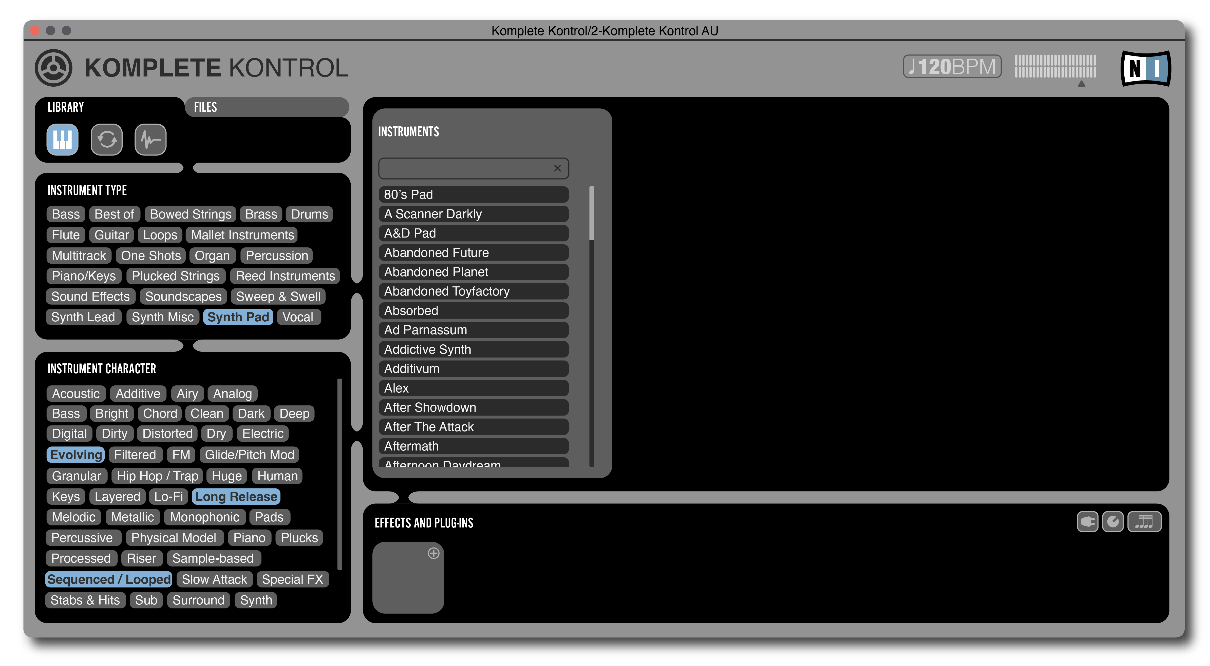
The Komplete Kontrol plugin is a shell application that hosts and houses other sound, effects and control plugins for use in digital audio workstations. A simple drag-and-drop action loads it into the interface, where the composer is able to choose from a list of attributes in searching for a patch. Looking for ‘soft‘ or an ‘airy‘ pad, for example, takes everything from those keywords in their library and matches the user to a sound they may be searching for. It’s truly a unique and powerful way to find the type of sound one wants, without having to guess through hundreds of plugins to find a sound style to fit the composer’s needs.
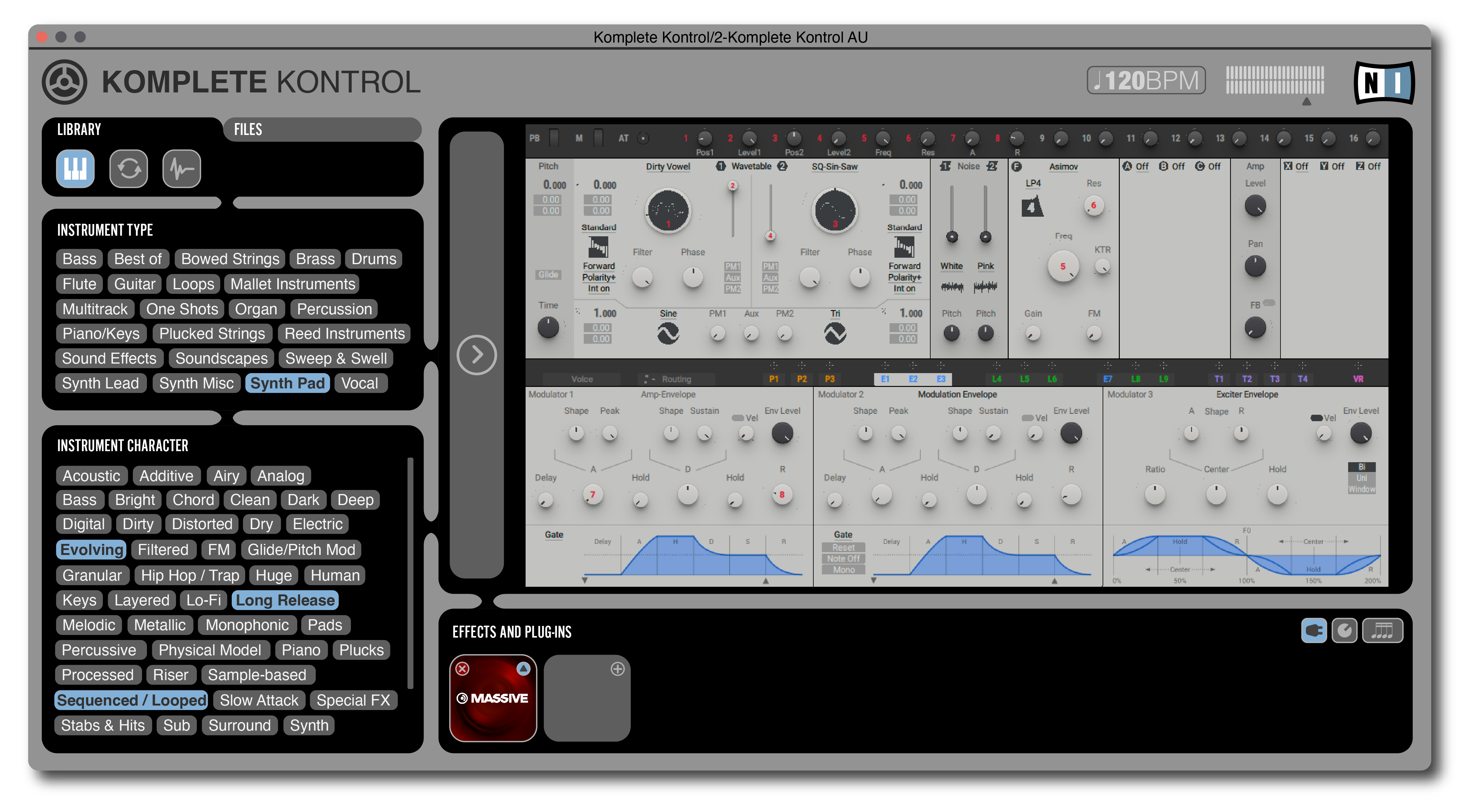
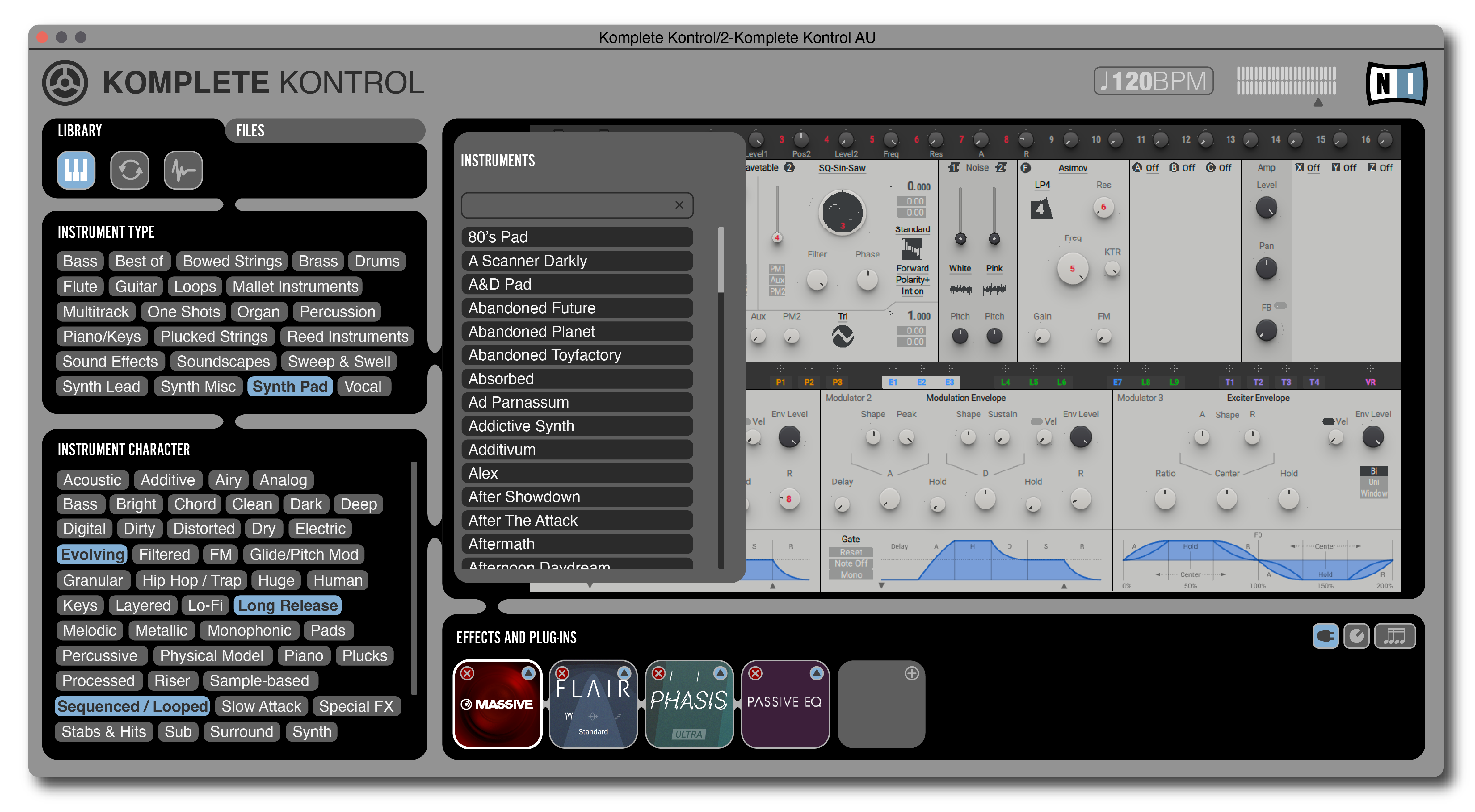
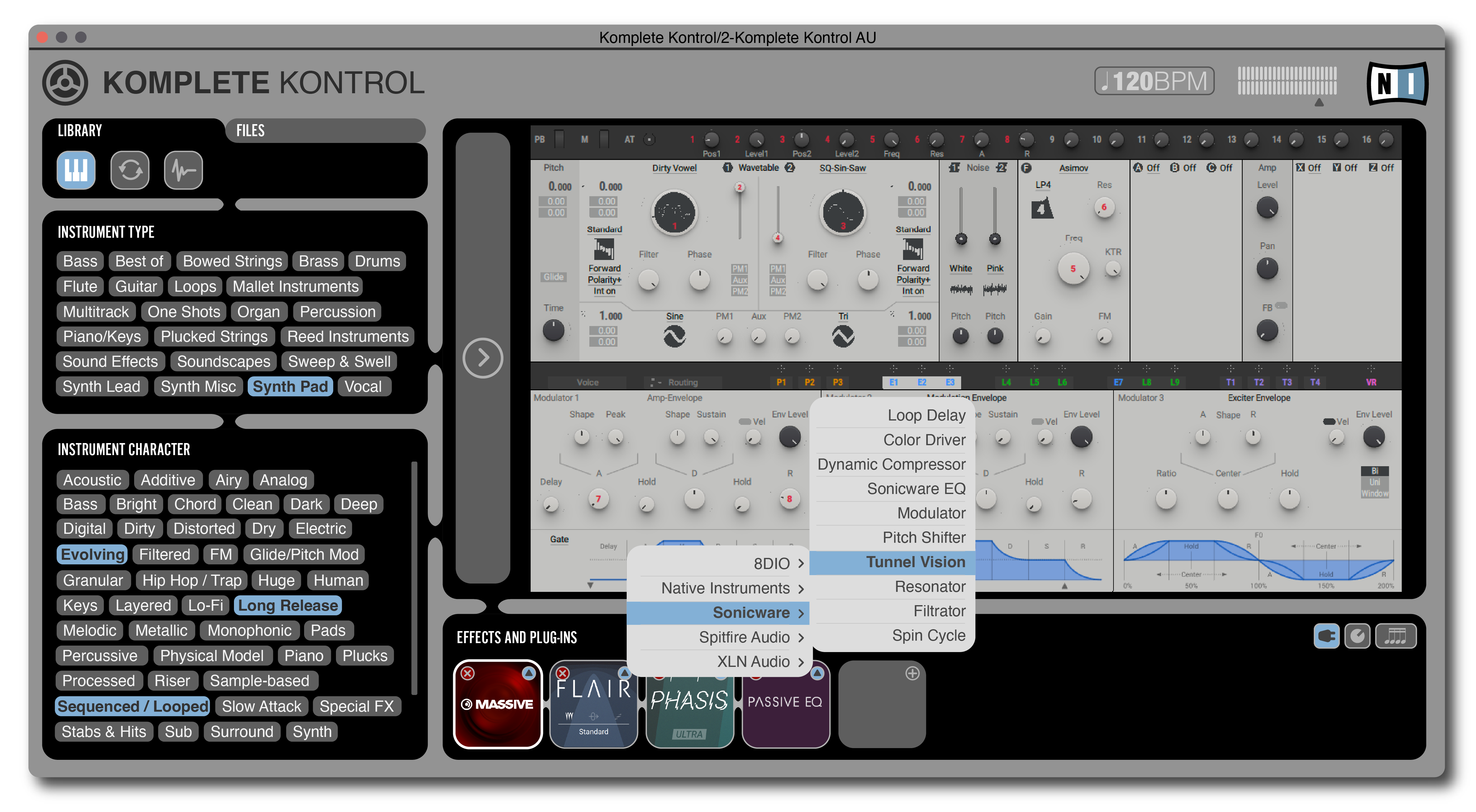
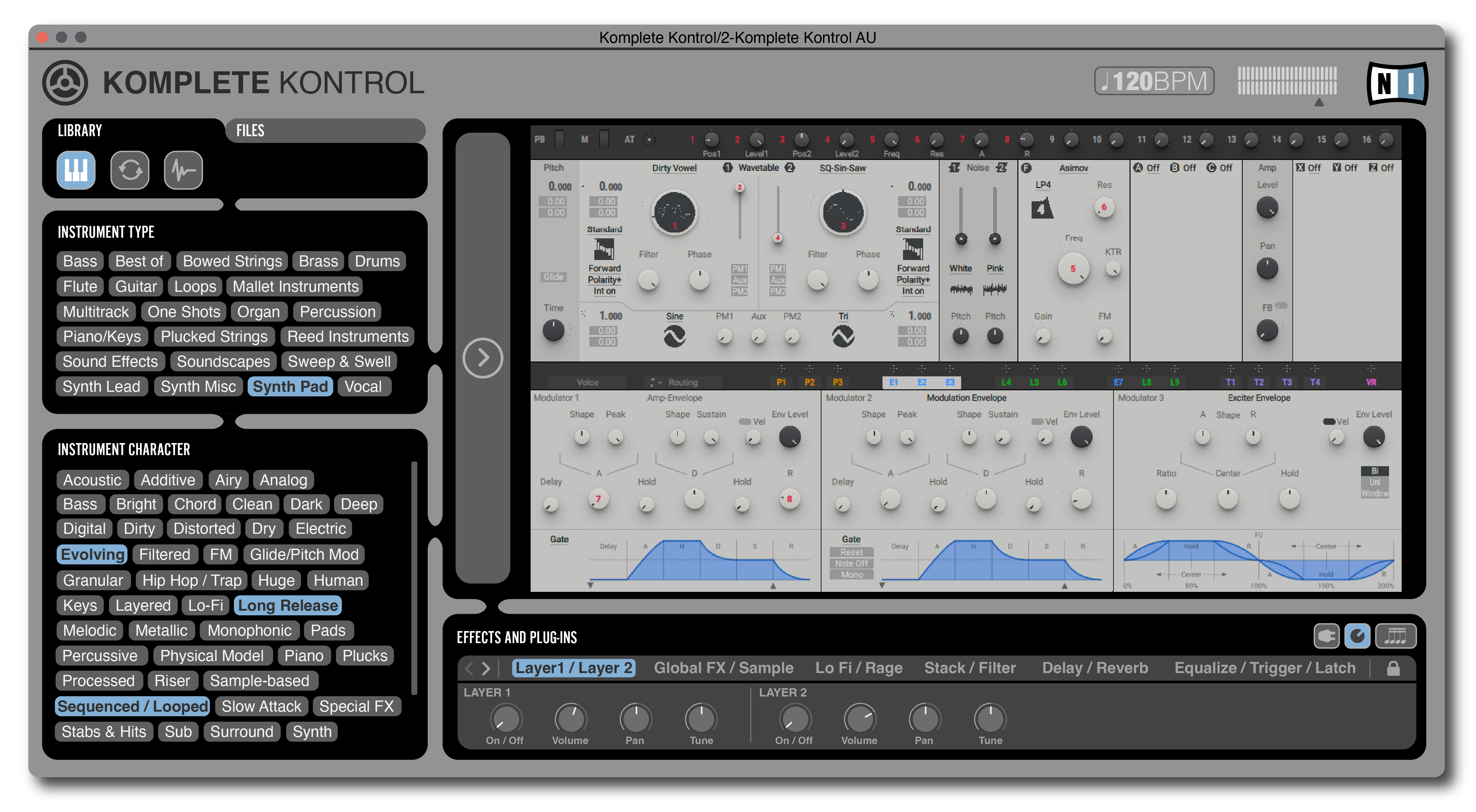
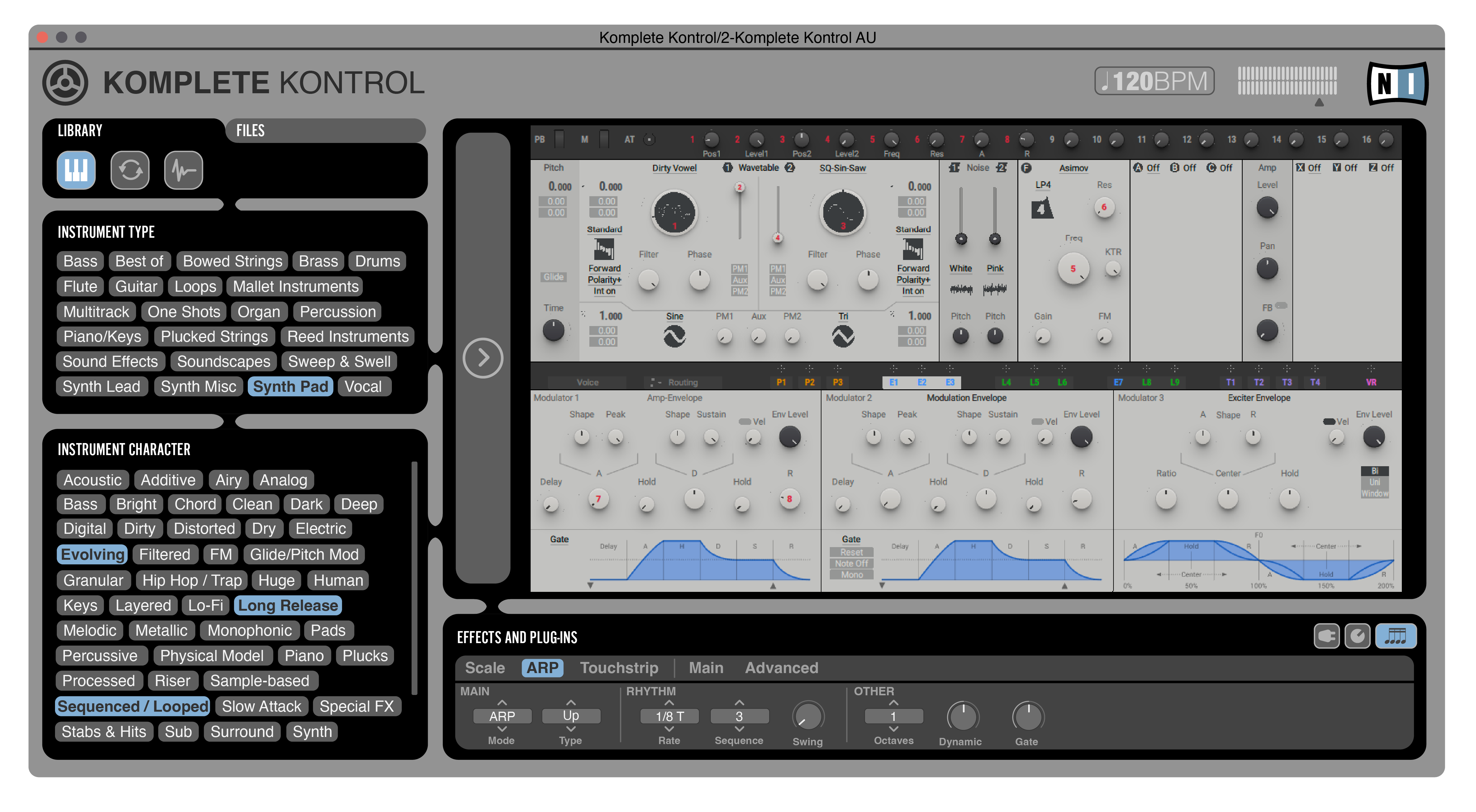
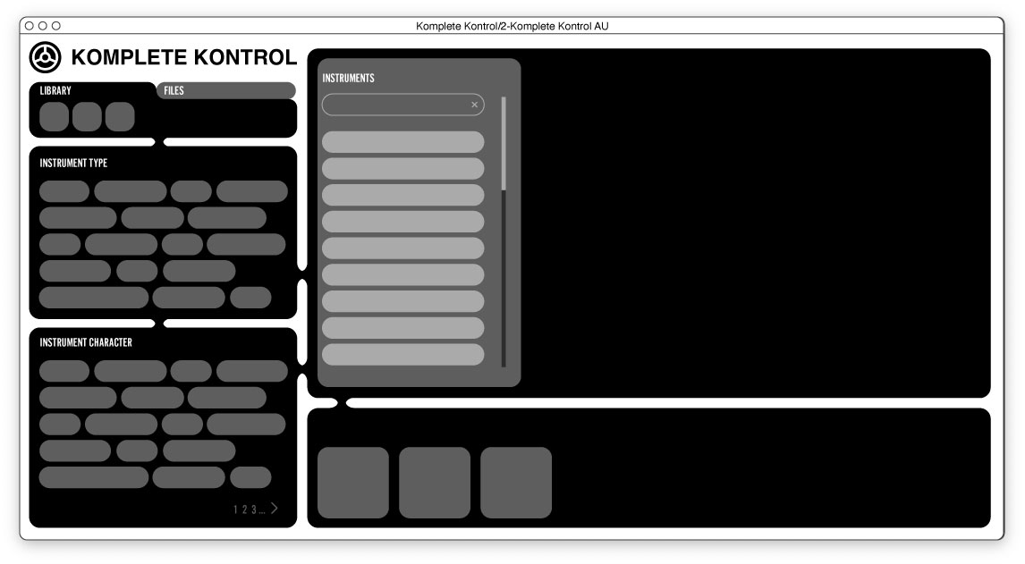
It’s also a very complicated process. In a small rectangular box (that doesn’t resize-a design feature I’d immediately change) the user chooses a set of attributes for instrument type, such as guitar, percussion or soundscape, and then chooses the character of that instrument with attributes such as bright, L0-Fi, or slow attack. The Instrument list appears over the top of the main plugin window to choose the main instrument. When the instrument is clicked, a small sample is heard that allows the composer to hear the sound without completely loading it. After that, the user is able to add effects and other controls to the plugin for playability.
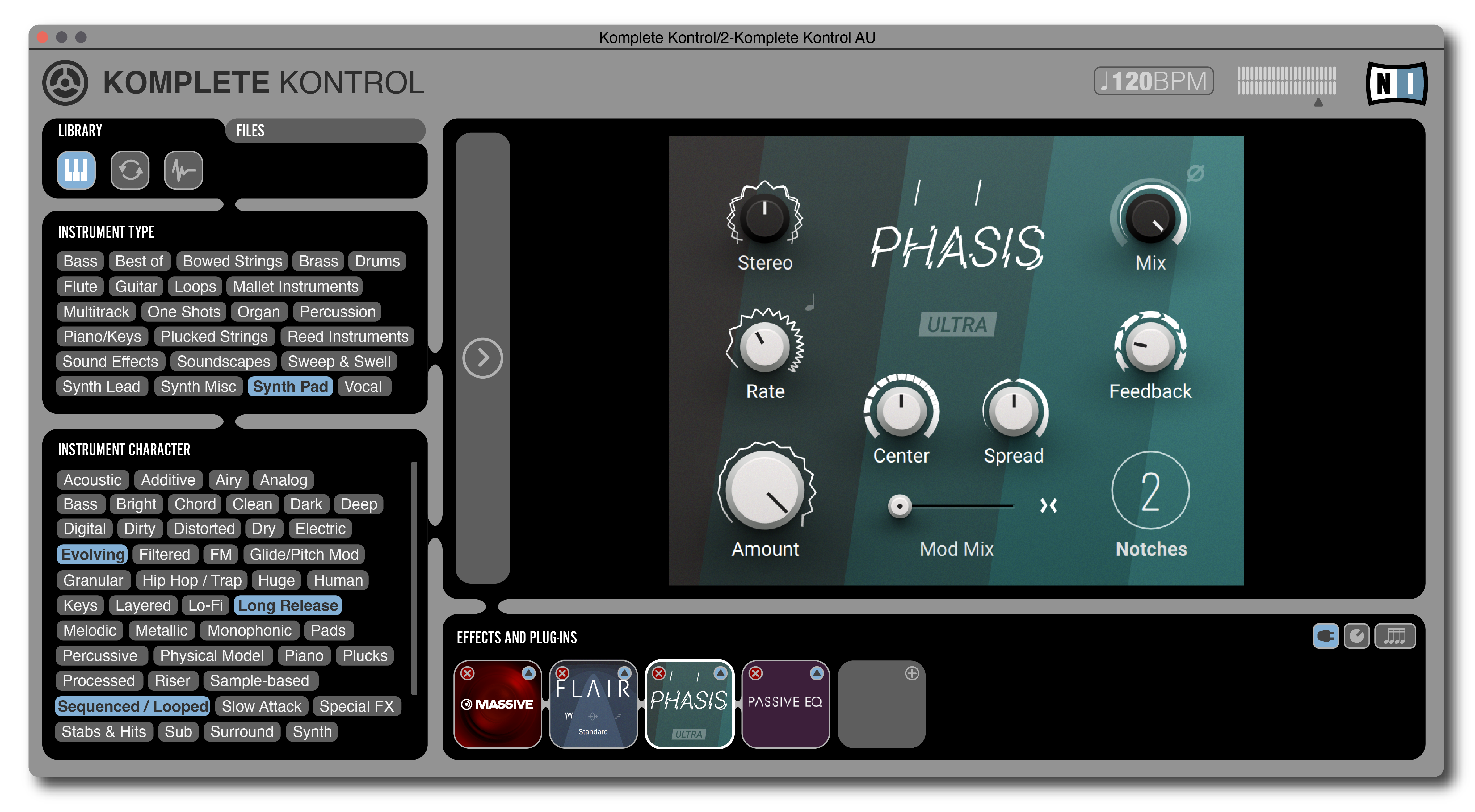
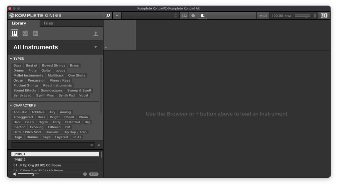
The biggest design challenge is that there is a lot of data to present and manipulate in a small amount of space. This window appears over the top of the DAW, and contains four separate areas editable to user. In the current design, the space is too small to adequately preview the instrumentation. Also, it’s not clear what is the direction of the current process, how to add effects or other plugins to further manipulate and control the host plugin.
I’m hoping this design follows the design strategy that many musicians would seek in choosing instrumentation for their compositions. The most important aspect is to find exactly the right type of sound by finding close approximations in the attributes of searched sound, and then be able to adjust it quickly and easy without disrupt the flow of the compositional process.
Below are screen images of the interface demonstration I designed for Komplete Kontrol by Native Instruments. Use the slider tool to move between screens, and click to enlarge to see more detail.
This is the design that is currently in production. I would guess I use it almost every time I compose in my workstation, which prompted me to want to redesign certain aspects to coordinate with a real-life example of a composer’s workflow.
This is an early mockup for spacing and layout. I also drew it by hand on grid paper. I like to draw by hand on grid paper to quickly flesh out ideas, strategies and design constraints.


