Nexus Finance Cryptocurrency App
Skill: UX/UI
Role: Senior UX Designer
Year: 2021
I guess it depends when and how you got involved, but the cryptocurrency juggernaut has been a fun little ride, hasn’t it? Of course, it seems like lately everyone is making an app to trade and track cryptocurrency that, when you think about it, is sort of the entire point.
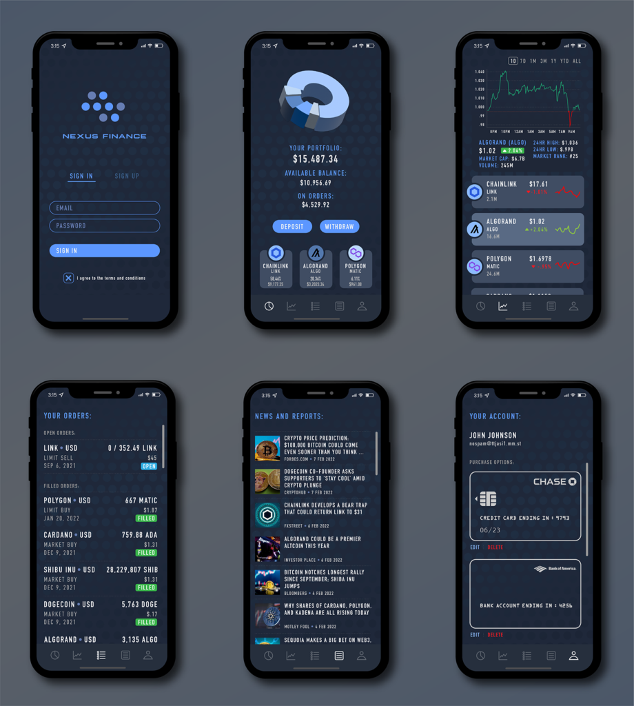
I’ve tried several of the apps, and there are features I like in a couple of them, but not an app that has all of them. Being able to trade, research, see news, and even get involved in forums àla the old Yahoo Finance app is exactly what I would use daily. Or every 10 minutes, depending on how the market is going.
Biggest design feature? Drop the exorbitant fees. I think fees are fine at small amounts that run a small company like this, but with fees that make some credit cards blush, I think competition will weed out the apps trying to take advantage of beginner early-adopters.
The design challenge with financial apps (after security, of course) is the amount of data that needs to be shown. I really tried to pare it down as far as possible while still making it usable. Some of the design solutions were home grown from my own wishlist: Graphs are good. Text is small but readable. Large buttons. Clear what I’m clicking on – this is money we’re talking about. Obvious process and knowing or at least having an expectation of what will happen next is key. And speed. It’s gotta be fast and up-to-the-second and let me know when something changes.
Of course, it’s not possible or even that interesting to show the features that really make an app like this exciting. So, I designed what I found as the beauty of data when organized in a way that makes it usable.
Below are screen images of the interface demonstration I designed for cryptocurrency app by Nexus Financial. Click on the image to see a larger version.