Adobe Creative Cloud Interface
Skill: UX/UI
Role: Senior UX Designer
Year: 2021
As a designer and a video creator, my entire life revolves around the use of Adobe software products. Photoshop, Illustrator, Premiere, After Effects and InDesign are my go-to tools throughout any given day, depending on the type of application with which I am tasked.
A cool idea Adobe had early on in their Creative Suite toolset was to make an entire platform surrounding the licensing condition for use of the software. Since Creative Suite is a subscription (SaaS) model, users would need to sign-in somewhere to connect to the service and keep a live connection so that Adobe can verify the licensing. Instead of a mere sign-in box that would stay resident in the user’s task bar, they designed an interface that had other features, both technical and marketing that appeal to users and invite them to more fully interact with Adobe and their products.
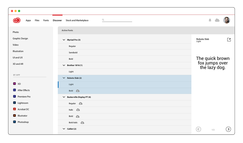
The Creative Cloud Suite interface appears to be form that followed function, and over time it has added features, products and tools that may enhance the designer’s experience in the broad scope of their design process. Stock images and video, fonts, and even cloud hosting are now a regular part of the interface’s offerings.
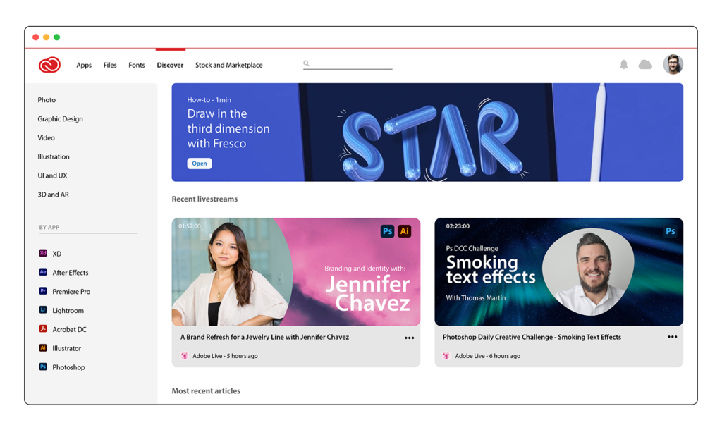
To put this all together in a single application, Adobe designed it similarly to a website that rests in the user’s task bar. A simple click opens the interface, where users can interact with the platform and change settings or download products for use in their projects.
Normally, I would personally be very much against this, as I don’t believe designers or users in general need to be subjected to more interfaces and platforms to run a particular piece of software or hardware. Consistency is key in an operating system, and it’s important that most applications operate similarly across the standard’s spectrum to facilitate ease-of-use. Adding a different and more robust experience per software or hardware application mires this process.
However, Adobe has done this carefully and thoughtfully, and I think because of the complexity and the size of the scope of Adobe’s Creative Suite offering it makes sense that it has its own ecosystem to control its products. The design challenge that I immediately was feature-creep, with several different types and locations of menus, and inconsistency in how data was portrayed. Data hierarchy is often sacrificed over time of a software products lifetime; as a product ages and more and more features are added, access to their component is simply bolted on instead of the heavy task of redesigning the interface. Uniformity is a key component to good design and usability, and I believe that the Creative Suite stands for a redesign to properly readjust the hierarchy of the data.
In the example interface I created, I discovered the following design challenges and offered these ways to fix them:
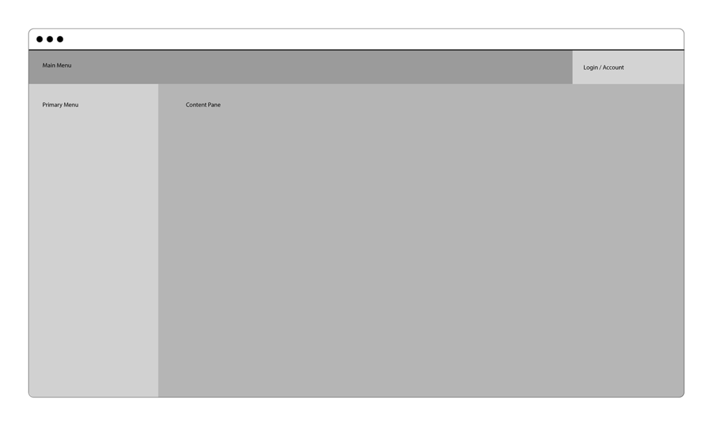
- The first thing I noticed was that the title bar contained menu elements that made them seem at a higher position hierarchy than the rest of the menus. I don’t believe anything should exist in a title bar, as it’s used as a system-level control in the overall interface.
- FIX: I moved fonts and cloud, and user/account data into an unchanging main menu
- Navigation appears to be an issue, as there 5 different menus in the interface at any given time.
- FIX: Menus needed to be consolidated to a main, primary and secondary. The main menu now runs along the top, and the primary menu for that content area runs along the left side.
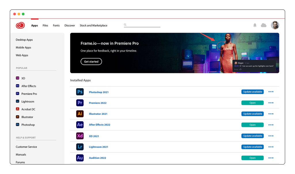
- The heat map probably indicates that the user relationship with the actual software and the updates is the most important and relevant component in the platform. It would need to be designed consistently with the rest of the design strategy.
- FIX: Although not really a ‘fix’ per se, the update screen was designed to be simpler to read and use with color-coded buttons and version numbers for each application. Also, the hero banner was made shorter to accommodate more real estate to the apps.
- Nearly all interface menu items contain an icon or other symbol to visually distinguish itself outside of the text description. It greatly clutters the cleanliness of the interface.
- FIX: This is probably a personal preference type of challenge, but I find icons with menu items and elsewhere to clutter an interface where just text will suffice. I can only imagine what the interface looks like in German with all of those icons. 30% more space is needed! 😀
- Marketing layouts are somewhat inconsistent with their hero banners and layout.
- FIX: It’s rather cool to have a little variance in the layout of the marketing sections of the platform. However, for consistency and easy of use, I found it better that all hero banners and layout parameters such as spacing and margins appear consistent throughout the process. It makes for a more uniform experience.
- Layout parameters such as spacing, padding, margins and font size were irregularly implemented. Also graphics were not consistently spaced and displayed.
- FIX: developed a design guideline, deployed a redline, and implemented mocks consistent with those variables.
Below are screen images of the interface demonstration I designed for Creative Cloud by Adobe. Use the slider tool to move between screens, and click to enlarge to see more detail.
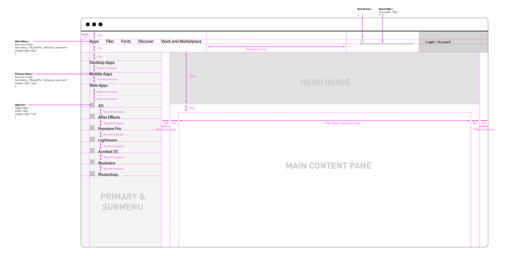
This is an example of the design redline.
This is a sizing mockup.